 In the wake of the massive uproar over the Springbok World Cup jersey, Australia’s fans have taken to social media to voice their opinions on the design of their newly launched jersey.
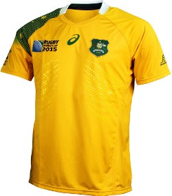
Words such as “awful” and “disgraceful” have been used to describe the re-design which boasts a stars-and-stripes feature on the right sleeve. The colour scheme remains gold – or rich yellow – and green and the stars are the southern cross.
The Wallabies logo, like the Springbok emblem, has been moved to the left sleeve to make way for the World Cup logo to satisfy commercial requirements.
Australia and South Africa’s jerseys have a similar look as they share a common apparel sponsor, Asics.
“I could have drunk a case of pineapple cruisers and eaten a mid-2000s Australia one day shirt and vomited out something better. Disgraceful,” said 1 die-hard fan.
And he was not alone in voicing his opinion about the re-design with numerous other fans sharing their thoughts.
However, for Wallabies coach Michael Cheika, it was the 2 consistent things on every Wallaby jersey that counted – and not the new colour scheme or design – the presence of the emu and the kangaroo.
“When the crest is there it means we are never going to take a backward step in what we do. That’s a really unifying force, that message. You can rest assured this Australian team will not take a backward step. We will be on the front foot the whole time.
“Anything that has the crest on it, for me, whether it’s baggy green or the gold jersey of the Wallabies or the green jersey of the Kangaroos, it’s an important piece of equipment and it is something you want to be proud of,” Cheika said.