“And then people want to know why we take drugs, to forget the fact that we are dressed as turds, that’s why”
In rugby, like most sports, teams and athletes have had a bad playing strip or two. Individual sports that comes to mind is cycling and golf. There have been some truly terrible creations that those athletes have worn, all in the name of sponsorship and moolah.
In rugby, its generally the alternate, or so called away strip, where designers indulge in a bit too much whacky weed before sitting down in front of the drawing boards. For the most part, kits are practical and speak of tradition and history, however, there are times that the Sporting and Designing Gods sincerely fall out and abominations like the ones that appear below.
These choices of ours are by no means exhaustive and is fairly recent in it’s selection, however, if you disagree, let us know and tell us which ones you think should have made the cut.
There’s ccertainly been some strange kit in recent years!
It appears the Kit sponsors want to stamp some sort of mark on their creations, so prepare yourself for some more strange jerseys in future!
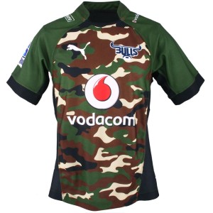
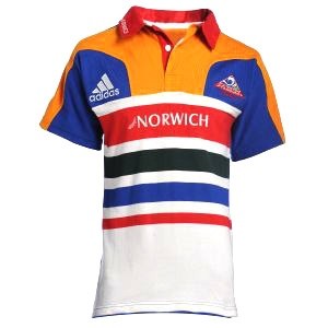
The Bulls like hunting, right? The Bulls like rugby, right?
Let’s have some brandies and coke and the last man standing can design our latest away kit. Thanks goodness rugby is being broadcast in HD nowadays, otherwise we would never have seen the Bulls play. They managed to take things one step further at Newlands and even camouflaged their score to such an extent that no one could see it.
The Vodacom Bulls Alternate Kit 2014:
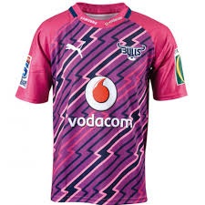
However, before we scorn ridicule on the camo outfit of the Bulls, let’s think about the alternative. Yes, of course, that embarrassment that was the alternative pink strip. What’s the one thing worse than forcing 120Kg’s of prime steak into a pink jersey? Forcing them to wear pink shorts and pink socks as well. What was curious though was that Wynand and Spies really seemed to enjoy the kit and was overheard trying to convince Wynie that, due to all the poached players in their squad, Loftus should also count as an away game…
The Vodacom Bulls Alternate Kit 2013:
It’s not just the 2014 Bulls that have sunk to new lows with their away strip, the Stormers weren’t to be outdone in the cringeworthy stakes and came up with a cross between a box of washing powder and a character from the Marvel comic collection.
The Stormers Alternate Kit 2014:
What were the Stormers thinking with their thunderbolt and lightning strip of 2014? Well, a damn sight more than their predecessors of the era when they were known as the… drum roll please… Western Stormers. Let’s have a look at the Advert for this jersey, shall we:
“Own a piece of Stormers history and a true collectors item. Replica of the very first Western Stormers rugby jersey worn for one season only in 1998.”
To those attempting to sell this explosion in a Plascon Paint warehouse, there is a reason they were worn for one season only, it was butt ugly.
The Western Stormers Kit 1998:
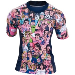
Stade Français now have a history of gloriously out there shirts. Some of which have been instant classics and fan favourites….others not so much. They have also conceived some genuine atrocities. For all the hidden and clever detail included in this shirt it is just a mess of faces and does not look good on the pitch. Stade Français keep it bold. Keep it pink. But also keep it simple and not like a scene out of the movie Poltergeist.
Stade Français 2010 Jersey:
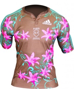
Sadly the Paris team make it on to our list twice. How could they not when they took the decision to change their new favourite colour of bright pink and swap it for a base of murky brown. As if the change to pink hadn’t been controversial enough, thankfully the brown has not been a consistent colour on the Stade pallet. The pink floral pattern only serves to highlight how awful the the colour of the canvas they are presented on. And lest we forget, they must get a second mention simply because they are French.
Stade Français 2008 Jersey:
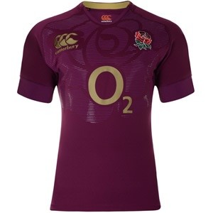
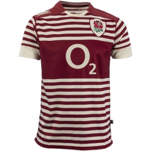
Playing in a pure white jersey with a red rose on the chest can make a man feel somewhat like a poofta, right? So how can we shake off that stigma and look more manly? We know, what if we dress like a famous cartoon dinosaur? Yes, England boldly went where no other rugby side had, basically because no other rugby side ever had the desire to play in purple.
The new England alternate jersey is inspired by the team’s history, taking its influence from the purple tracksuits worn by players in the 70s, 80s and early 90s. The purple colour of the shirt honours that tradition, while elegant gold detailing emphasises England’s position as a member of rugby royalty.
So read the spin doctored reasoning, rugby royalty indeed, they look like the Queen’s purple rinsed hair.
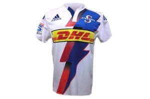
England Test Match Kit 2012:
Last, but by no means least, England features once again. In 2012 Canterbury of New Zealand took over the rights to produce the English playing kits. Does the date 1 December 2012 ring any bells? Anyone? No? Here’s a little hint, England 38 New Zealand 21. That’s right, England humiliated the All Blacks at Twickers, so those kind folks at Canterbury of New Zealand decided, right back at you Poms. And judging by this beauty, revenge is a dish best served cold, even though this dish looks like a dogs breakfast.
England Alternate Kit 2014:
Engeland se truie lyk ok, maar die Bulle en Stade Francaise se bontspul lyk geensins na rugbytruie nie.
1 @ Pietman:
Engeland is darem “far removed” van hulle tradisionele kleure, en pers?
Now here is a trivia question for you, on the topic of jerseys, that The Tackler put to yours truly on Voldy way back in 2005;
Hamilton RC in Waikato, NZ and Wellington RC in the NZ capital, what do they have in common with their namesakes in South africa?
And if any, why?
I have just spoken to GBS, there are prizes to be won for the first TWO correct answers, sponsored by Rugby-Talk:
1st prize: One week free accommodation in the Pofadder Hotel in Pofadder, the heartland of Boesmanland rugby.
2nd prize; Two weeks free in the Pofadder Hotel.
Come on RTs, let’s see your answers, starting NOW!
nortierd wrote:
Sure, not traditional by any means, red roses, LOL!
Can you imagin a little Pommie saying: “Dad, one day”when I am grown up, I want to be a rose!”
Or even more gruesome, a ‘cock’! (Little Serge or Pierre…)
In both Wellingtons they imbibe in the fruits of the nectar and have a bit of a barney before the headache sets in?
4 @ Pietman:
Ha ha ha
Little Serge and Pierre might not ask for it, it just happens naturally.
Come to think of it, Danny Grewcock would have blended right in with the French jumper logo….
3 @ Pietman:
Are both Hamiltons the oldest clubs?
Can’t recall whether Hamilton in CT is the oldest or not.
Yeah… that Western Stormers jersey was pretty appropriate… considering out team at the time…!!
Best jersey… ever… imo… was one of the NZ teams… can’t remember which one… which had a really cool wrapped barbed-wire design… Really clever design… and really cool as a rugby jersey…!!
Maybe one of our Kiwi mates can tell us which team it was…
About the only other rugby jersey I’d wear… beside my nearly 30-year-old, long sleeve, sponsor free, 100% cotton wp jersey I still wear to games..!
cool article Nortie… and really well done with all the articles you’ve collected/published or written… very impressive work there bud…
you’re a Natural…!! Just like Bob Redford…!!

@ nortierd:
@ 5 BZZZZZZZZ!!!! nope, sorry, wrong answer…close on Wellington though.
nortierd wrote:
I think Villagers first, then Hammies, in the western Cape.. But the first club in the country was in PE, believe it or not.
@ nortierd:
Seems Hammies is the oldest according to Wiki
Hamilton RFC, Sea Point
From Wikipedia, the free encyclopedia
For the Scottish rugby union team, see Hamilton RFC.
Hamilton RFC
Logo of Hamilton RFC, Sea Point.png
Full name Hamilton Rugby Football Club
Union Western Province Rugby Football Union
Nickname(s) Hammies
Founded 1875
Location Sea Point, Cape Town, South Africa
President David Kagan
Director of Rugby Dean Berry
Coach(es) Anton Moolman
League(s) WP Super League A
2[1]
Official website
http://www.hamiltonsrfc.co.za
Hamilton Rugby Football Club was founded in March 1875 in Cape Town, and states that it is the oldest rugby union club in South Africa. Hamilton RFC played in the first official match at Newlands Stadium on 31 May 1890.
The club’s inception occurred when a Mr. W. Nightingale called together a meeting of football enthusiasts at the offices of Messrs. Hamilton Ross & Co.[2] The meeting took the name of their club from a Hamilton Football Club (est. 1868) in Scotland of which Nightingale had been a member. The club merged with Sea Point Rugby Football Club in 1910 and in 1914 adopted its current jersey colours of three wide bands of red, black and yellow.[3:
Noudag julle verwys na die oudste clubs, wat is nou wees die novelty van Adelaar sportgronde in Pretoria? ek onthou iets daaroor in Trivial Pursuit n paar jaar terug, maar kry niks op die internet nie.
@ MacroBull:
Ja, Adelaars, daar is n stukkie geskiedenis…ek sal ook bietjie soek.
Bestaan die klub nog ooit?
@ Pietman:
Die sportgronde bestaan nog, die club wat nou daar is is Naka Bulle.
@ MacroBull:
Naka Bulle! Wie is hulle?
Ek onthou Pierre Spies Snr het vir Adelaars gespeel.
9 @ ufo:

Thanks UFO
17 @ nortierd:
Sorry for the rather brief reply on mail earlier…
I was in the middle of the throws of loading and customising my new Notebook, Mail, Files & Folders ect.
I’d been loathe to load Windows 8 or 8.1 till recently, for myself as well as for clients, due to the rather “User Unfriendly Interface” or maybe rather the “Differing Interface” to what the average clients are used to.
Personally I totally dislike the flippin massive Windows 8 & 8.1 Icons Startup Screen, which almost pre-supposes that you have or favour a bloody Touch Screen!
However, a few simple tricks, manipulations and downloads later… one can have your Startup Screens back to how it was under Windows 7 (including having the Start Button in the lower lefthand corner and it’s menus)… and one can even have your Desktop Gadgets back to what it was (I use some of the Desktop Gadgets for specific purposes, for instance multiple World Clocks for NZ, Aussie, SA, UK and Argentina times).
Of course, with the large amounts of RAM I like to have in a PC / Notebook, the option is always to impliment the 64-Bit versions of the Operating Systems & Software.
What I have now is a comfortable Notebook, with a friendly display, just the way that I want it… and when I apply it for clients, it will make their transision from Windows 7 to Windows 8.1 a breeze.
I was also loathe to move away from the comfort and ease of the familiarity of Microsoft Office 2010… over to the beast which is Microsoft Office 2013 (I do not have any intention or inclination to move to Office 365 EVER!)…
But I have now gone over to Microsoft Office 2013 Professional Plus, once again with some minor tweaks to make the transision more seemless.
Must say I like some of the features Office 2013’s Outlook has!
In the last week or so I have also acquired a shipload of other new Software to employ and integrate at the same time.
For instance, I much prefer using the latest Corel WordPerfect Office Suite for typing & spreadsheet purposes… both on the Word (WordPerfect) and Excel (Quattro Pro) side of things. It is just way more powerfull… whilst one can still save those same documents in Word or Excel formats!
I also use Corel’s CorelDraw X6, Adobe Master Collection CS6 (with amongst others PhotoShop CS6), Cyberlink PowerDVD 14 Ultra & Cyberlink YouCam 6 Deluxe, Nero 14 Platinum Suite, Adobe Acrobat XI Professional (not just the standard Adobe Acrobat XI freeware download), Teamviewer 9 Pro, some lekker sound & DVD Mastering Tools, Deamon Tools Pro, Corel VideoStudio X7, Presto! PageManager 9 Pro (fabulous Scan Manager for any Scanner), a good Youtube Downloader, UltraISO, Skype, Dropbox, a few Web Development Softs and Editors and some IT specific Softs & Tools.
As you can see from the exhaustive list… it takes hours for me to get a PC / Notebook to where I want it to be… for my use and enjoyment!
Anyway, the Notebook is done, Software is loaded, all the Files & Folders transferred, the Mail Boxes & Contacts set up, old Mail and Contacts imported… all Softs customised to my liking, all Updates are done and all Service Packs are applied… ect.
Now I feel like a new man… with new tools!
Tonight I still need to clone and configure 4 External Hard Drives (loaded to the brim with Softs & Tools for my IT business), as well as a handfull of 64GB Flash Sticks, which I use for a variety of purposes… from Bootable Install Disks, to Software Distribution devices, to mobile storage space for the transfer of simpler stuff.
My late dad, GBS Maksimus, used to say “As jy sukkel, word jy ‘n sukkelaar… so moenie sukkel nie!”, and that is exactly what I felt like a week or 2 ago, till I just said basta and started the rejuvination here, big time.
Hopefully I can now climb back into R-T with a bit more purpose too.. seeing as I should now have more time available… with the better tools at my disposal.
@ grootblousmile:
Nou toe sien jy, eintlik maklik as man bietjie moeite doen…..
Wellington in NZ and Boland in Wellington, SA… they wear the same black/gold kit don’t they? Come to think of it, Boland wear black/pink now.
@ Rage:
Yep, Wellington in SA and Wellington NZ have the same strip exactly, black with gold trimmings, and “W” embossed on the left of the chest. Boland Union almost the same, except for the bunch of golden grapes on the logo.
Hamilton RC in Sea Point and Hamilton Club in Waikato also have the exact same kit.
WHY?
Well done Rage, pack your bags, you have won a week at the Pofadder Hotel 😀
Lucky you
@ Pietman:
At one stage all Harlequins clubs worldwide wore the same strip as well.
Not sure if it’s still so.
@ nortierd:
Nope,correction, he only got half the answer right, still didn’t say WHY?
So, sorry, only the 2nd prize for Rage, two weeks in the Pofadder Hotel, but on the house of course…
@ Pietman:


@ Rage:
Users Online
Total 37 users including 0 member, 37 guests, 0 bot online
Most users ever online were 3735, on 31 August 2022 @ 6:23 pm
No Counter as from 31 October 2009: 39,397,288 Page Impressions
_